Fluxus Performance Script

Banana-Boat

Two or more persons perform.
Swimmer wears red to match carpet floor.
Swimmer enters library tower.
Swimmer takes position.
Girl is seated. Banana on her knees.
Girl waits.
Swimmer stretches. This is a warm up.
Girl waits.
Swimmer begins to undress. Red comes off.
Girl hands swimmer purple shirt.
Swimmer takes shoes off.
Girl hands swimmer yellow cap.
Swimmer removes pants.
Girl hands swimmer goggles.
Swimmer is redressed.
Girl waits.
Swimmer inhales and moves to floor. This is a dive.
Girl peels banana.
Swimmer begins laps. This is swimming. 
Girl eats banana.
Swimmer swims.
This is Banana-Boat.

Amie Cunat

Amie Cunat was a challenging artist to evaluate, especially given my lack of experience and understanding of her particular genre and methodology. I was always surprised by how contrasting my initial responses to her work and her brief illuminations were. Pieces that seemed to me to be mere explorations of color and shape — essentially studies in effective design — were conceptual, multifaceted masterpieces to her. This great element of subjectivity seemed to play a large role in her artworks. Countless interpretations could be generated from a single piece, if enough time was committed to it. Time, however, is a commodity which we treasure highly in North American culture. And work that requires many layers of unraveling — unraveling which requires many leaps of logic for the average viewer, or a strong foundation in abstract painting concepts — is unlikely to spark much deep intellectual conversation in typical, public contexts. I feel that Cunat spoke about these conversations as if they were implicit, though I doubt if they were brought up by a common viewer, they would be considered by others with much weight. Obviously we take Cunat’s conceptual explanations to be true, because she is the only person on earth who truly holds the merit to define the message of her work.

9

That aside, Cunat brought up some interesting prompts for her pieces, be they implicit or utterly cryptic. She explored psychological language barriers, painting as a physiological, human act, and the effects of tactile experience when filtered through sight.

She described her first paintings as being single events which occur simultaneously in a whole. To me, this implied that her work came very close to exhibiting a true two dimension state, where all elements exist on a single plane of not only space, but time. Although I found the message unclear, and the paintings unpersuasive, perhaps even apathetic, I enjoyed this conceptual exploration of 2D space-time. Cunat moved on to touch on her affinity for and obsession with patterns and textiles. These works were much more involved, and aesthetically more ambitious. They asserted a kind of atmosphere and space that previously was absent. Almost moving in an evolutionary path of dimensionality, Cunat then brought up recent sculptural works. Although her overall body of work was surprisingly uniform and solidified for someone so young, her later work was marked by more experimental 3D sculpture and installation — a venture which I found far more enticing than her earlier pursuits. Cunat remarks how 3D works can “create new context for a preexisting site”, essentially reshaping an open space into a used, potentially interactive space. Sculptures, I feel, do present heightened elements of touch, utilitarian usage, play, and informal interaction. These elements did seem to compliment Cunat’s conceptual process well, particularly her fascination with juvenile objects/ spaces.

Amie-Cunat

Transparency became a key player in many of her paintings, acting as a way to both hide information and resist the viewers immediate impression, thus adding just a second layer of time to her 2D work. One image occurs, then the hidden image gives itself to the viewer, after some hesitancy. This approach inserted some interesting linguistic implications as well as potential for (slightly) more complex 2-part narratives, as apposed to static, simultaneous imagery.

8855

Cunat’s Japanese heritage and her relationship to the Japanese language came up a number of time throughout her talk. She sought to deconstruct her “corrective language”, and explore how language is harnessed in early development years. Again, I found her work to function as an elusive lilt when formulated within its intended context. There were hints of language, academic formatting and childlike impressions, but nothing to take me to that next step of comprehension which she spoke about. Perhaps she didn’t wish to imbue her work so explicitly, perhaps she doesn’t care what the takeaway is, but I would argue that if an artist has a strong conceptual foundation for her work, she should balance instincts towards enigmatic aesthetic, and messaging through more obvious means. In my (current) opinion, inclusiveness and accessibility should always be on a artists mind if she means her work to be successfully experienced.

Animation Concept

IMG_7606_Edit2I want to explore relationships between siblings and the shared experience one has with a close relative. My stop motion animation is designed to represent two individual mindscapes and how they interact to become a whole. There are visual motifs that imply ‘opposite’, ‘alien’ and ‘reflected’. I want to show outside phenomenon, some like viruses, affecting and damaging the figure. Many events in the animation represent specific life events that have shaped both me and my sister. I want to show visually how each of us absorbs traumatic, memorable, unexpected experiences. And how our perspectives overlap, sometimes counter-intuitively.

IMG_7646

Jarett Earnest

Jarett Earnest opened his lecture with a thought provoking comparison between two art pieces from unexpected origins — Giovanni’s Madonna and Child and “Rorschach Blot” by Lisa Yuskavage. These two briefly mentioned artists would reoccur over and over throughout his talk, often with links being drawn between the two seemingly unrelated practitioners of art. Earnest occurs as down to earth, witty, and unwilling to put on an all to often contrived ‘high art’ mystique. The market-driven, faddish nature of  the Art World of New York City was briefly called to stand, specifically the current obsession with object oriented ontology— a study that is clearly not important to his own critique methods. I appreciated his little quips at the ever fabricated and skin deep state of art markets. He also seemed willing to open himself up to embarrassment, and concsiously show a certain level of immaturity (and genuine wonder) in his approach to viewing artworks. Although he seemed in tune with some technical aspects (color theory, general composition of shapes), he wasn’t bogged down by a mountain of overused art critique tropes. Overall, I found his personality refreshing.

eatme (study for Rorschach)

Giovanni_Bellini_-_Madonna_and_Child_-_WGA01777

Earnest’s approach to evaluating and in some ways quantifying the paintings which he displayed was somewhat simple. Perhaps a little too simple. I enjoyed, however, that he made his thought process digestible by honing in on just a few aspects which he truly admired about the two previously mentioned artist’s works. Color use, emotional/ psychological implication, and religious connotation were some of his main concerns when dissecting art during his lecture.

Earnest provided his thoughts on the usage of trigger warnings, especially when it comes to art, arguing that “art should have weird, disturbing subject matter because life does.” I’ve personally become disenchanted with the widespread propagation of political correctness. There is a point where we depart from just respecting one another to censoring one another. Art, especially, shouldn’t be limited to a range of PC values. Earnest links our general numbness to and fear of emotion to PC culture, as well as our overuse of technology. We lack real, face-to-face, honest communication nowadays. This has potentially disastrous effects for artistic communication as well.

Moving on and beginning the more conceptual part of his lecture, Earnest describes his recent experiences in Rome and iconic Roman art museums. He explains how he started viewing art in a time like he never had before, where each piece might only exist in that moment for him because he might never return to that spot. This state of viewership provided a whole new level of meaning. Earnest discusses the psychological and emotional urgency imbedded in Greco-Roman religious artworks — how they were intended to overwhelm audiences, and perhaps convince them to attend places of worship and become zealots themselves. After going through countless of these intensely evocative ‘in your face’ kind of works, Earnest stumbled upon Giovanni’s Madonna and Child, in direct contrast. The piece occurs with a conventional, nuanced beauty, where baby Jesus’ head “glows like a bowl of milk being hit by moonlight”.

Earnest compartmentalizes aspects of the painting, explaining some contexts of its creation and its storytelling. Much of his assessment is very subjective to his own interpretation, and some I didn’t relate to at all. Nonetheless I enjoyed his evaluation of the piece (and other Giovanni’s in a similar vein) and how he correlated them to contemporary works by painter Lisa Yuskavage.

Yuskavage’s work existed in an enticing zone somewhere between pop and classical painting. It had a sleekness and compositional simplicity, but also (as Earnest discussed) a basis in complex color theory and some beautiful, classic technique.

YUSLI0750-483x600

Earnest spends a good amount of time elucidating his ideas on color and color’s paradoxical relationship to many things, such as language. Wherein we can only apprehend color through language — It can’t be described any other way. Also, there are very few things in world that don’t change color over time. Earnest says twice, “there’s something profound about that”. His fascination with color entered a religious context when he associated color with the metaphysical realm. The concept of father, son and holy ghost, for example, imitate the relationship between primary colors. Earnest touches on duality as well, where opposite colors neutralize one another when combined to become grey. Painting with grey, also known as Grisaille, came up multiple times. I’d love to explore painting using only subdued colors more.

Animation As Art

Is animation fine art? Animation often critiqued for being too involved in commercial world. Can be used to explore a variety of media, multi-dimensional. Appeals to wider audience, can be easier to engage common public.Historically, Animators were throttled by strict requirements for cinema. Reserved for gag, slapstick, cinema-derivative narratives.

 John Stuart Blackton – A founding father of stop-motion animation

hqdefault

Founded Vitagraph studios – Became most prolific american film studio.

Oscar Fischinger – Made abstract musical animations in 40s, 50s. Explores spacial illusions, color theory, in 4D format. Would he have had more or less success as a purely abstract painter, instead of animator?

tumblr_nfauu79EaG1r5djyno1_1280

Robert Breer – “founding member of american avant-garde.” Combines abstract, representational, hand drawn rotoscoping, photos, etc.

robert-breer-bang-film-still2

Morgan Ashcom

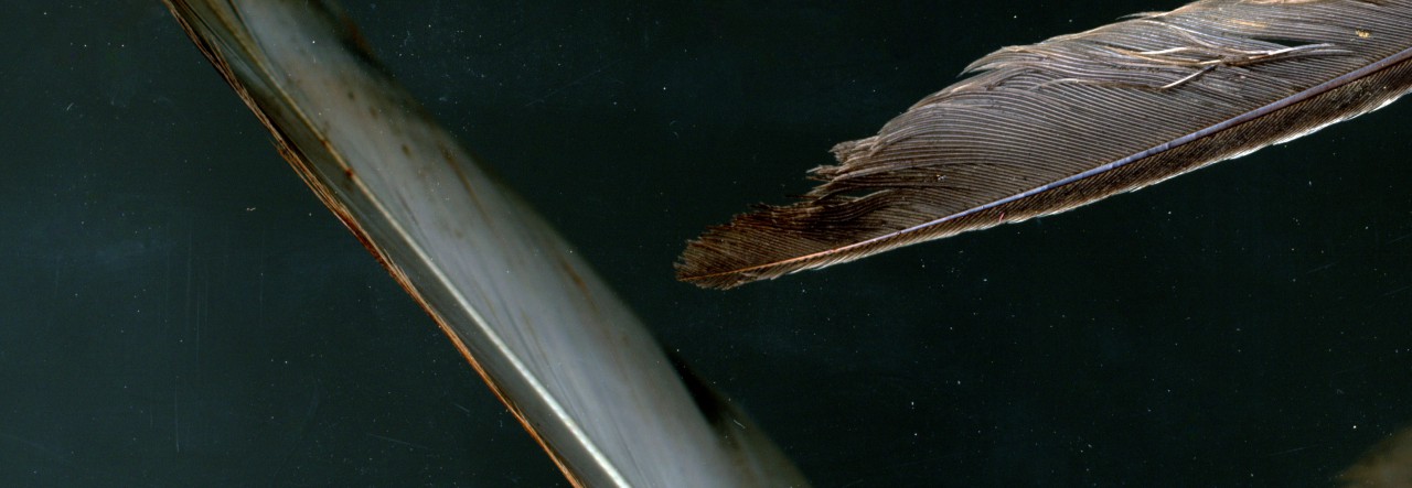
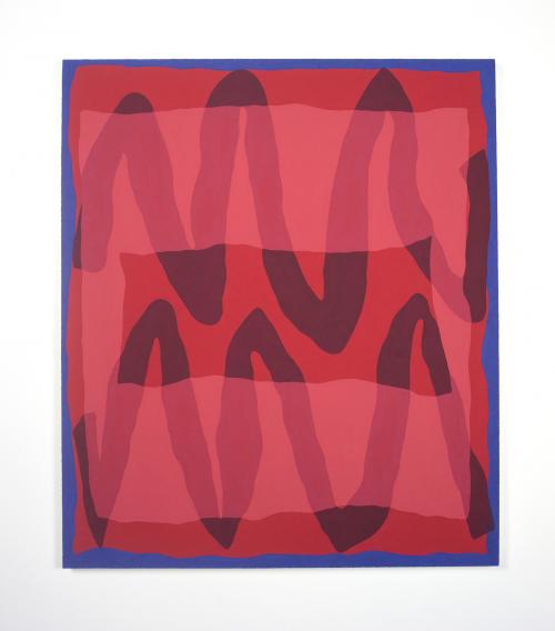
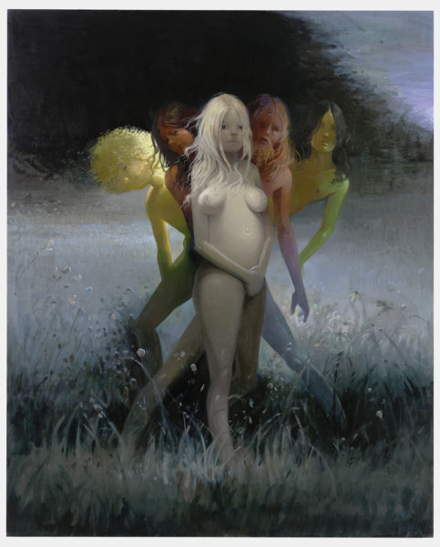
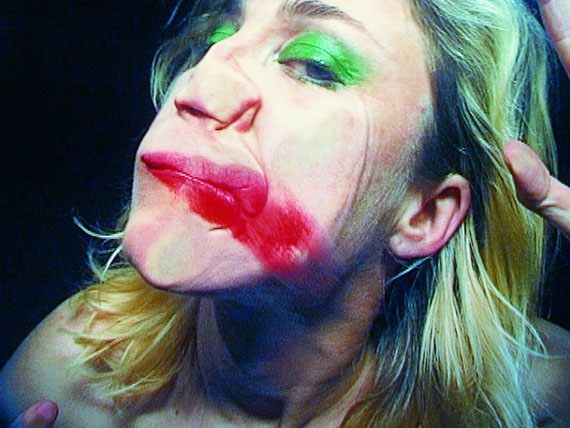
Morgan Ashcom initiated his talk with a two and half minute long montage of his skater-punky dystopia series which he refers to as “Leviathan”. The polished, labored, perhaps enhanced appearance of his work contrasts strongly with his seemingly gritty documentary style approach. He explains, however, that he does not intend for his work to exist within real social, political or cultural climates, but rather stand on their own as photographic works of art. I felt that this supposed pursuit and his actual body of work contradicted each other. Perhaps that was another intentional element.

Ashcom scattered a few short art history lessons amidst his lecture, beginning with the iconic French cave paintings of the paleolithic era hunter gatherers. He remarks how despite their constant fight for survival, early humans still took out precious time to create art. Moreover, they still found great significance in art. There is an implied concept that artists somehow desire to “outlive yourself” and outlast death, through instilling your being into a more permanent object. This opener foreshadowed Ashcom’s later thoughts, and arguably, his overall thesis.

Ashcom proceeded to flick through slides depicting his greatest influences, providing short dialogues into the subject matter of the artist or piece, but never lingering long enough for the audience to really absorb each one. This, I felt, was a huge oversight on his part. It was challenging to link his references back to his own practice and create any kind of cohesive understanding of his overall experiences.

“I value the photograph for the photos sake more than people, background, or facts behind the photo”, he said at one juncture, making it clear that he focuses more on the presentation, aesthetic, and immediate perception of his work, more than inherent, documented substance.

He explains that although he utilizes a medium which viewers take to be a tool for factual documentation, we can still develop fantasies and romantic narratives surrounding those seemingly factual images. This narrative of fiction existing in spite of reality can provoke a more powerful response than a medium such a paint, which we tend to immediately view as a work of fiction.

Ashcom provided three main characteristics which define his work. Allegory, where “one fact points to another”, Tropology, where we are presented with a moral to a story, and Analogy or “a way of reading nature that includes the most possibilities.” Although I understood how some of these could apply to individual photographs, I had difficulty applying them more generally to his approach. This was another contradiction that stood out.

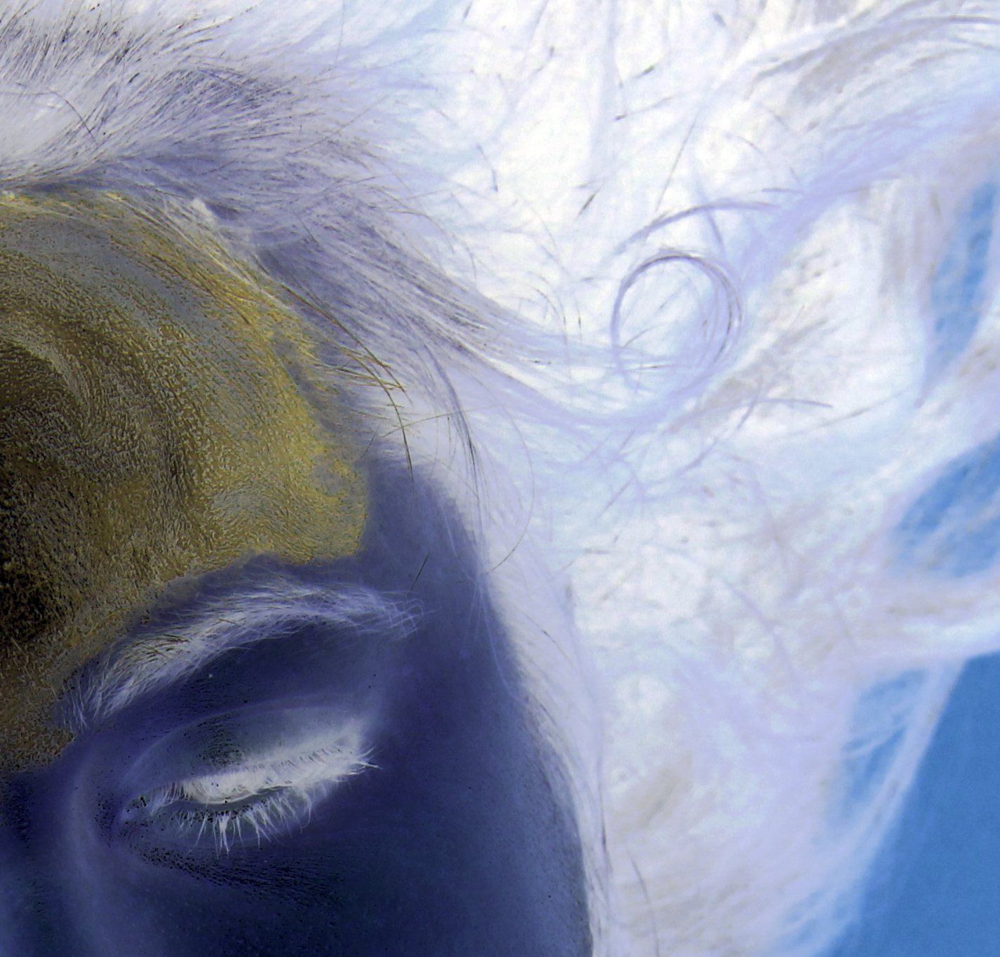
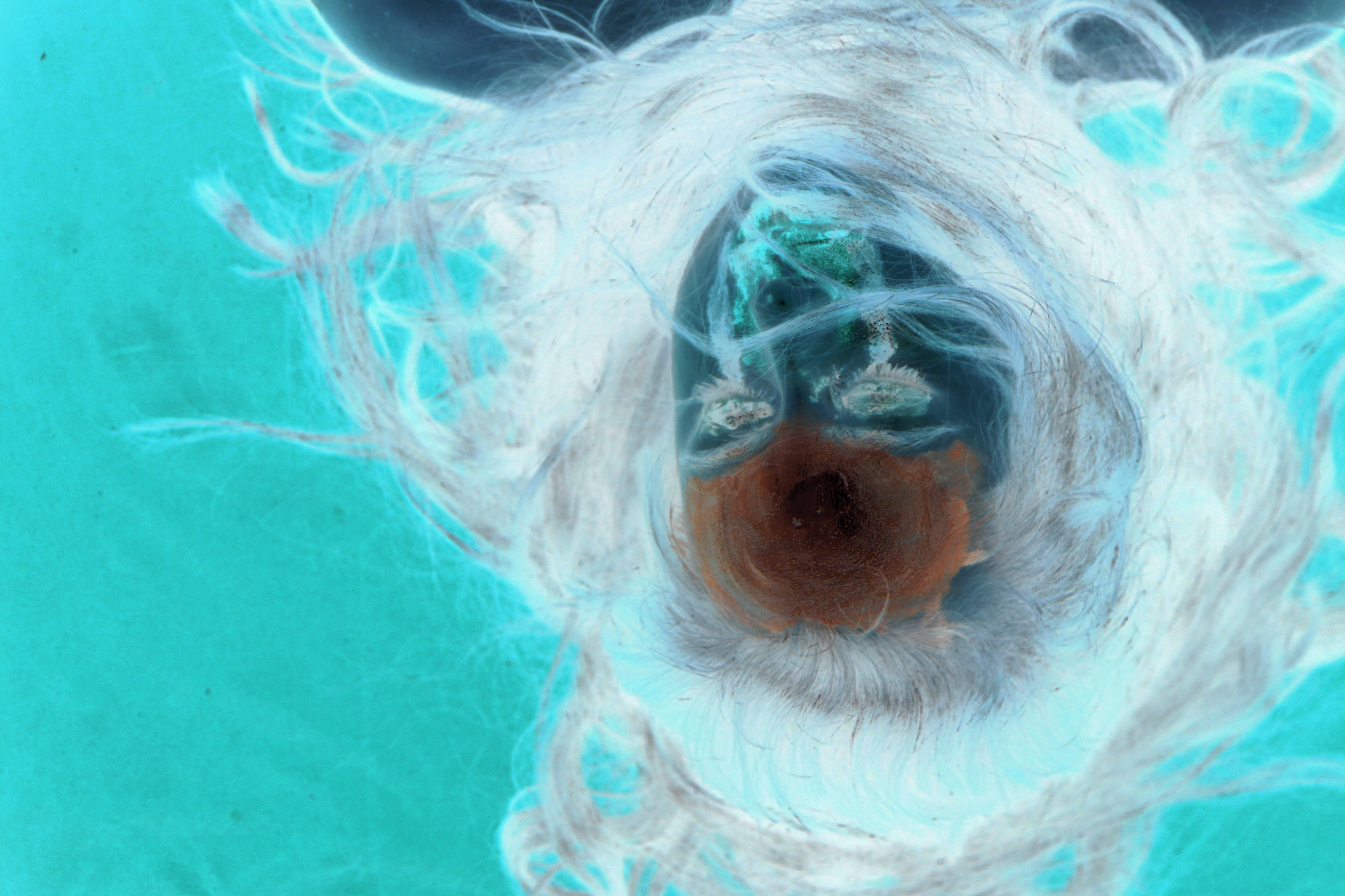
Early on, Ashcom marks his distinction between abstraction and distortion. He argues that photos can be distorted, but not abstracted, and to characterize a photo as such is misleading. Ashcom explains that he is interested in the very thin line between what you know — what you see and understand — and what is unspoken, what you don’t see a.k.a. your own narrative. Photos exist within these more limited margins, he says. In other words, they cannot be entirely abstract. I agree with his linguistic analysis of the word abstract, although I wondered how it might hold up under different contexts, as when understanding sculpture – a media that is often attributed with the term abstract, yet still exists within tangible, material space. Should we critique sculptures using a different term that describes something nonrepresentational, but not necessarily unreachable or intangible?

Ashcom goes on to mention some cinematic influences and reminds us that while photographs are not literature or film, they are in direct conversation with those mediums, especially when placed within a book-like format — a common format for the photo.

I enjoyed Ashcom’s short tangent which discussed civilization’s continual devaluation of beauty through the overuse of certain elements and composition. Over time, we become numb to the cliches, “which is sad, because these images still have things to offer”.

Ashcom’s work seems to foster a dialogue between our instincts of romanticism, pre-conceptions about documentation and concepts of tangible reality.

PIPILOTTI RIST

Rist went to the School of Design, Basel, Switzerland. Studied audio-visual communication.

Themes: Gender, sexuality, human body. Includes uplifting music. Includes Feminist thought predominantly. Employs audio to instill emotion, sometimes contrasting with visual information to create tension.

26683

“Open My Glade” (2000)

tumblr_m37yehATKE1qlq8kpo3_1280

“Ever is Over All”

Digital Composite, Breaking Down the Body

In this project I chose to explore the concept of decomposition, or breaking things down to their components. I investigated this idea as it relates to the human body by creating a digital composite of the chemical elements within the body, in various states and molecular structures. I wanted to represent humanity’s physical oneness with natural structures which we have an impulse to disassociate from entirely. Aesthetically, I approached this concept differently from my Feather composite (grid assignment), choosing to create a design oriented image as apposed to a more enigmatic, naturalistic environmental scene.Art_Seminar_Breaking_Down_Human_Body

Artist Statement – Immateriality and the Grid

LUCAS GANDY
IMMATERIALITY & THE GRID

Birds of flight and feathers are deeply woven into stories of faith, morality and freedom as well as many culturally specific metaphors. Feathers exist as perhaps the most commonly mentioned and depicted animal appendage when humans seek to describe our own condition. This ubiquitous attraction to the usage of avian features in culture and ideology creates potential for many interpretations of a feathers meaning, as well as ambiguity. The history of feathers pertaining to religion and symbology prompted me to approach assembling the scanned images in a way that represents my own elusive take on god’s presence (or lack thereof) within a cosmic landscape.

Visually, I wanted to capture a vast, obvious movement in my project, which contradicted the qualities of my small and nebulous material. While a feather’s veins create a solid, linear pattern that moves with purpose, the wispy, hairlike after feathers posses no set directionality or form. I was however drawn to the high transparency of after feathers, their see-through quality allowed for digital layering without sacrificing authenticity of the object. One surprising outcome of scanning was the painted, surreal appearance of certain images — they occur as altered, yet authentic captures of nature.

Utilizing a series of squares (grid) initially felt like a limitation, and I struggled to eliminate their straight lines and shape them into a more naturalistic environment— that of birds and feathers. Eventually I found myself bringing back specific digital edges, however. These areas don’t attempt to hide the digital nature of my piece, and in fact accentuate it in some cases. I feel this relationship between biological nature and geometric virtuality is an interesting aspect of my image.

Scale was a prominent factor in my decision making throughout. I sought to create a landscape inspired by immense, often overwhelming galactic satellite images. The idea of inch-long after feathers representing a 5 million lightyear wide space intrigued me to explore how size is perceived within various contexts.